After facing the reality of coronavirus and taking a forced (but necessary) hiatus from travel, we decided to use the time to reflect on our website and make some changes. The result is a brand-spanking-new design!

A lot has happened in 9 months
Looking back over the 100 blog posts we’ve written, it’s clear we’ve been busy! Taking the time to stop and appreciate the amazing places we’ve visited not only strengthens our resolve to travel extensively when the restrictions end, we’re also keen to showcase these incredible experiences on a better website.
Out with the old
A 9 month old website isn’t too old, but we have learnt a great deal in the short time we’ve been sharing our travels online. In 100 posts we realised we’d outgrown the old site design. The homepage layout felt inflexible and the template for displaying posts needed an overhaul. Rather than modify what we had, we decided to rebuild from the ground-up, including a few under-the-hood changes that’ll help us in the future. Fortunately, one of us works in technology, although we were wondering where on earth we were going to find the time to rebuild the website so soon after launching… And then a coronavirus lockdown was imposed in the UK and we suddenly had all the time in the world!
We looked at our analytics data and page performance to determine what was working and what wasn’t. After spending time considering the sites we enjoyed reading (and those we didn’t), we came up with a rough idea of what we wanted our new site to look like. The next step was to build it and migrate our old site data.
In with the new
After a few evenings of moving data around on AWS, we were ready for the switchover.

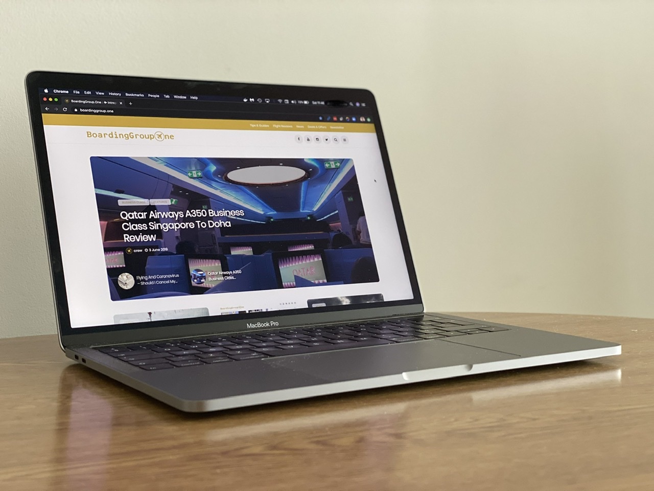
Our homepage is very similar to our old one, but with a few distinct improvements.
First, we’ve cleaned-up the header and the navigation that lives up there. We’ve tidied-up the logo and the kept the area around it clean. Also, we dropped the old airline ticket header, although we expect that’ll be making a reappearance elsewhere on the site in future. We gave links to our various social media feeds prominence at the top of each page, complete with cool icons!
Moving down to the featured article section, we’ve replace the old static slot with a carousel of featured posts. We keep the bold imagery from before.
Better fonts for readability
We also used this opportunity to improve the readability of our text in both mobile devices and desktop browsers. We’d found some posts weren’t that easy to read on mobile, so we’ve changed the font and switched it to solid black.

As you’ll see, we’ve opted for clean page design, strong headers and well-spaced paragraph text. Optimised for reading!
Full-width imagery
We also felt we could use our images to fill the full width of the screen, making better use of the available space and giving more prominence to the great images.

Work in progress
Overall we think the new design is a vast improvement on the website we launched with. We also think the arrangement of information on each page (information architecture) flows better and is easier on the eye.
There’s a widely-held belief in technology that nothing is ever finished and this is especially true with the BoardingGroup.One website. We have a list of improvements we’re looking forward to showing you over the coming months.
We hope you like the changes we’ve made and welcome your comments below, especially suggestions for future improvements.
1A and 1K
Leave a Reply