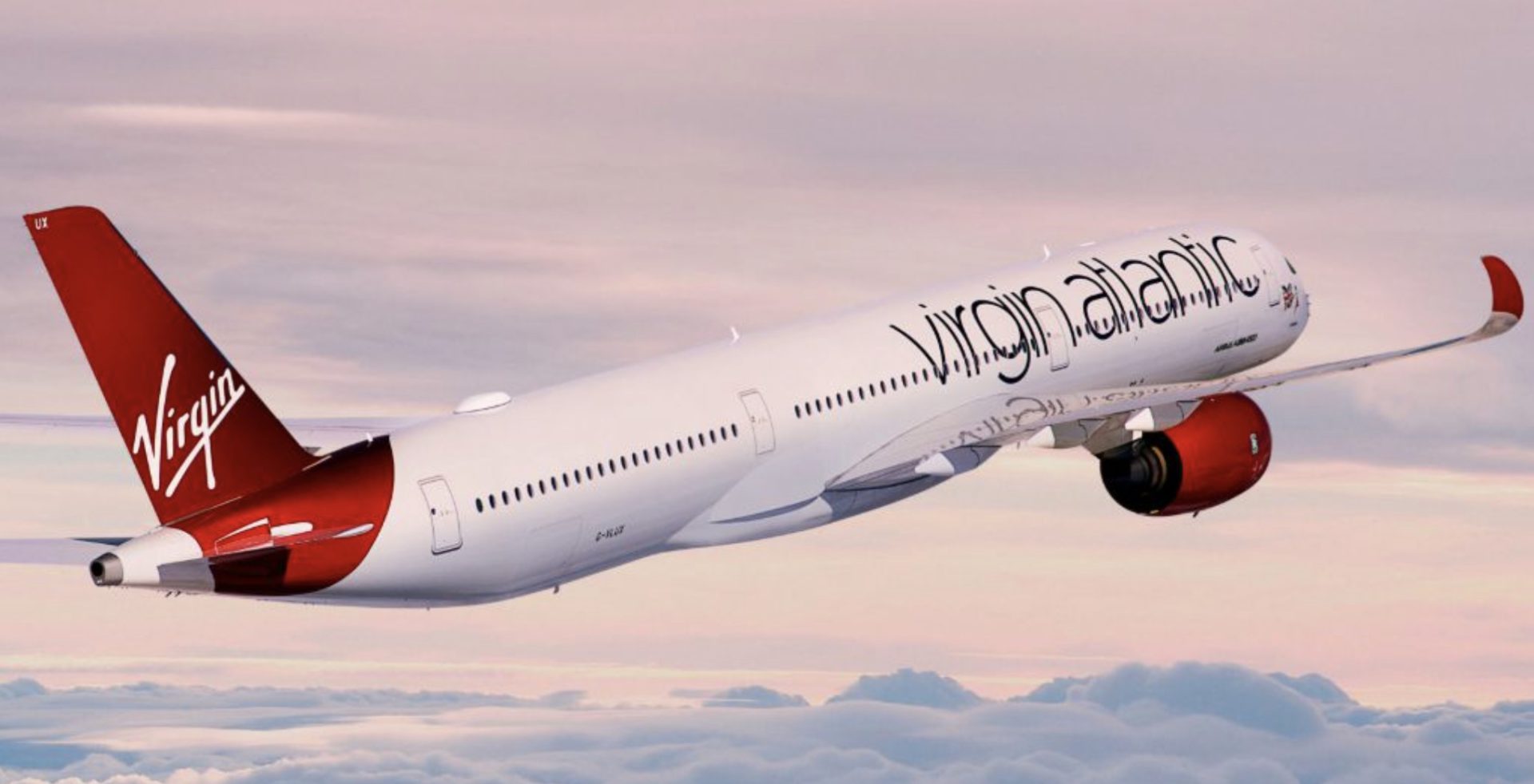
Virgin Atlantic has not just updated its old app. It has ripped out the plumbing and started again.
The new Virgin Atlantic app launched on 2 March 2026 with a new listing, cleaner design and the sort of polished opening video that suggests someone in airline tech has finally found the skip.
That deserves credit. Airlines love patching ancient systems until the thing resembles a boarding pass held together with sellotape. Virgin has done something braver. However, a brave rebuild still has to survive booking flows, check-in, account access and distracted airport use, when passengers are usually holding a coffee, a passport and a mild sense of doom.
Launch screen on the new Virgin Atlantic App
A new app isn’t automatically a better app
Most passengers see a new app and assume progress. Airlines encourage that assumption with talk of booking, check-in, trip management and boarding passes all living neatly in one place.
On paper, Virgin has a decent launch story. At the time of checking the UK iOS App Store listing, the app was showing around 4.5 out of 5 from roughly 1.7k ratings. The Android version fares even better on the UK Play Store with 4.8 out of 5. That’s a good show by consumer app standards.
Virgin says passengers can view trips, manage travel details, choose seats and meals, request assistance, check in, store boarding passes and scan passports.
But airline apps are not normal apps. If Spotify glitches, I listen to silence and question my Internet connection. If an airline app forgets context during check-in or payment, I start wondering whether I still have a seat to New York.
Where it still feels unfinished
The better bits are obvious. I tested the app while logged into Flying Club, and the account detail feels more integrated than before. Seeing reward voucher information in the app is very useful. Issue dates and expiry dates are exactly the sort of things frequent flyers check before making a booking.
Authentication also looks more serious. The eight-digit email code feels more secure than the old-school approach many airline apps still cling to. Then Virgin spoils it slightly by not allowing paste.
That sounds small, but it is daft. Passengers do not enter login codes while sitting peacefully at a desk. They do it in airport queues, on patchy mobile signal, or while trying not to miss a boarding call. Secure design and usable design should not be enemies.
Booking is the missed opportunity
The main problem sits in the bottom navigation bar. Tap “Book” and the Virgin Atlantic app presents what feels like a web flow inside the app.
That undermines the point of the rebuild. If I am effectively using the website, I may as well open Safari or Chrome and get proper browser controls. Captive web views can be brittle around back buttons, payment pages, session persistence and sign-in context.
Virgin made the harder call by starting again. It then stopped short at one of the most commercially useful parts of the app. Hopefully that comes next.
Concierge feels early
Virgin Atlantic Concierge is the flashy bit. It sits behind the AI star icon and opens through another web view rather than feeling like a tightly built app function.
The first interaction does not inspire total confidence. There is a warning that you are dealing with AI, that it may get things wrong and that it cannot yet manage bookings. Then it asks for microphone access, with audio starting by default.
AI disclaimer on the new Virgin Atlantic App
Concierge may become useful. I can see a future where it helps with route ideas, destination planning or reward seat prompts. Right now, it feels early. A travel app should first nail booking, managing trips, checking in and boarding passes. The AI assistant can improve once the core flows are stronger.
This is not a bad app. In several areas, it is plainly better than the old one. The visual design is cleaner, the launch screen feels properly Virgin, and Flying Club visibility has improved.
I would use it now for Flying Club account tasks, voucher expiry dates, trip overviews and boarding passes. I would also use it for routine check-in, assuming it behaves on the day.
I would be more careful with booking. If the app drops me into a web view during search, sign-in or payment, I would switch to a full browser before entering card details or building anything complex.
Virgin has done the bit many airlines avoid. It admitted the old app needed more than another patch, then built a cleaner base for the future.
That deserves praise, but not a free pass. The new Virgin Atlantic app still sends passengers back to the web too often, and the AI layer has arrived before some core flows feel fully native. Virgin has done the hard part by starting again. Now it needs to finish the job.
Virgin Atlantic has not just updated its old app. It has ripped out the plumbing and started again.
The new Virgin Atlantic app launched on 2 March 2026 with a new listing, cleaner design and the sort of polished opening video that suggests someone in airline tech has finally found the skip.
That deserves credit. Airlines love patching ancient systems until the thing resembles a boarding pass held together with sellotape. Virgin has done something braver. However, a brave rebuild still has to survive booking flows, check-in, account access and distracted airport use, when passengers are usually holding a coffee, a passport and a mild sense of doom.
A new app isn’t automatically a better app
Most passengers see a new app and assume progress. Airlines encourage that assumption with talk of booking, check-in, trip management and boarding passes all living neatly in one place.
On paper, Virgin has a decent launch story. At the time of checking the UK iOS App Store listing, the app was showing around 4.5 out of 5 from roughly 1.7k ratings. The Android version fares even better on the UK Play Store with 4.8 out of 5.
That’s a good show by consumer app standards.
Virgin says passengers can view trips, manage travel details, choose seats and meals, request assistance, check in, store boarding passes and scan passports.
But airline apps are not normal apps. If Spotify glitches, I listen to silence and question my Internet connection. If an airline app forgets context during check-in or payment, I start wondering whether I still have a seat to New York.
Where it still feels unfinished
The better bits are obvious. I tested the app while logged into Flying Club, and the account detail feels more integrated than before. Seeing reward voucher information in the app is very useful. Issue dates and expiry dates are exactly the sort of things frequent flyers check before making a booking.
Authentication also looks more serious. The eight-digit email code feels more secure than the old-school approach many airline apps still cling to. Then Virgin spoils it slightly by not allowing paste.
That sounds small, but it is daft. Passengers do not enter login codes while sitting peacefully at a desk. They do it in airport queues, on patchy mobile signal, or while trying not to miss a boarding call. Secure design and usable design should not be enemies.
Booking is the missed opportunity
The main problem sits in the bottom navigation bar. Tap “Book” and the Virgin Atlantic app presents what feels like a web flow inside the app.
That undermines the point of the rebuild. If I am effectively using the website, I may as well open Safari or Chrome and get proper browser controls. Captive web views can be brittle around back buttons, payment pages, session persistence and sign-in context.
British Airways has lived with this problem for years and the BA app as a shining example of what happens when airlines bolt modern design onto older systems.
Virgin made the harder call by starting again. It then stopped short at one of the most commercially useful parts of the app. Hopefully that comes next.
Concierge feels early
Virgin Atlantic Concierge is the flashy bit. It sits behind the AI star icon and opens through another web view rather than feeling like a tightly built app function.
The first interaction does not inspire total confidence. There is a warning that you are dealing with AI, that it may get things wrong and that it cannot yet manage bookings. Then it asks for microphone access, with audio starting by default.
Concierge may become useful. I can see a future where it helps with route ideas, destination planning or reward seat prompts. Right now, it feels early. A travel app should first nail booking, managing trips, checking in and boarding passes. The AI assistant can improve once the core flows are stronger.
Read our Virgin Atlantic A350 Upper Class Los Angeles to London Heathrow Review
A better base, not the finished house
This is not a bad app. In several areas, it is plainly better than the old one. The visual design is cleaner, the launch screen feels properly Virgin, and Flying Club visibility has improved.
I would use it now for Flying Club account tasks, voucher expiry dates, trip overviews and boarding passes. I would also use it for routine check-in, assuming it behaves on the day.
I would be more careful with booking. If the app drops me into a web view during search, sign-in or payment, I would switch to a full browser before entering card details or building anything complex.
Virgin has done the bit many airlines avoid. It admitted the old app needed more than another patch, then built a cleaner base for the future.
That deserves praise, but not a free pass. The new Virgin Atlantic app still sends passengers back to the web too often, and the AI layer has arrived before some core flows feel fully native. Virgin has done the hard part by starting again. Now it needs to finish the job.
Read our Virgin Atlantic Clubhouse Heathrow Review
Give us a follow on TikTok and Instagram.
Related Articles
Economy class innovation, or comfort sold separately?
Qsuite Next Gen A350: Five Years Unbeaten & Growing the Gap
Happy anniversary: the BA Amex Premium Plus will change for the worse
Cathay Pacific Aria Suite Already Flying From Europe